Podcast: Play in new window | Download
Subscribe: RSS

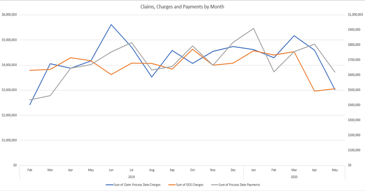
This BIG Idea is a project I finished Saturday to track claims by file date, charges by date of service, and claims by post date on one chart over the past 16 months or so. With the pandemic slowing down charges and receipts, this practice wanted to graphically see claims going out the door compared to charges to make sure there was no lag there. At the same time, it helps to show payments on the same chart since we expect to see a lag between charges and payments. The chart by the podcast on my website is the monthly version of the chart. Listen to the podcast for ideas about the weekly version of the same chart. There are advantages and disadvantages to charting data weekly, but COVID-19 has practices laser focused on cash flow. Weekly charts might help your practice better focus as well.
