Podcast: Play in new window | Download
Subscribe: RSS

Do your providers know how they are doing on key metrics compared to their peers?
Is the process automatic?
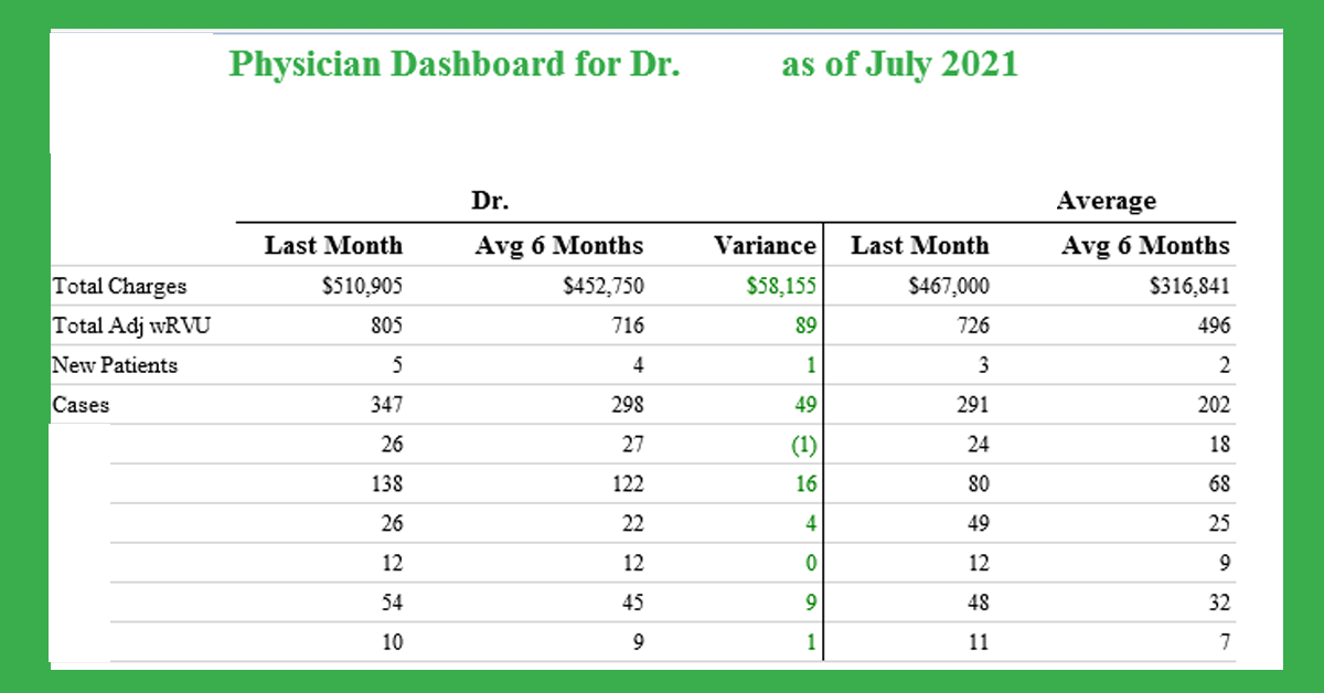
Today’s BIG Idea is a simple dashboard that is automatically emailed to providers monthly. The dashboard has key metrics compared to historical averages and comparable providers. A color-coded variance column tells providers at a glance which metrics are up or down. The dashboard can be automatically emailed to administration a few days before the providers see the dashboard so that variances and surprises can be investigated before providers see the dashboard. You choose the key metrics and relevant comparisons. What are you waiting for?
